
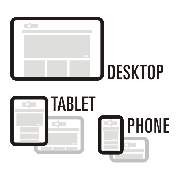
 A “responsive” web site adapts to fit the width of a smart phone, tablet, or desktop browser window. The words you are reading are in a responsive web design. Change the width of your desktop browser, maybe, rotate your tablet or smart phone from portrait to landscape – the same web page content is redistributed to fit the width of the browser window.
One design fits all.