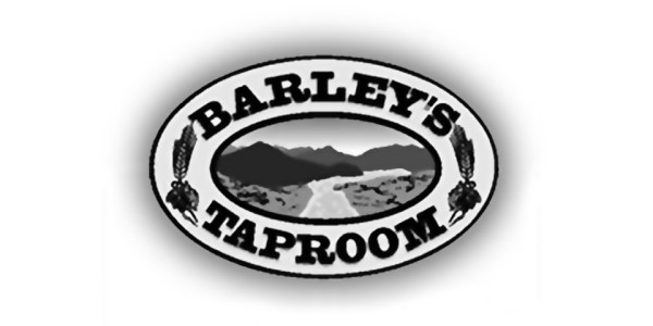
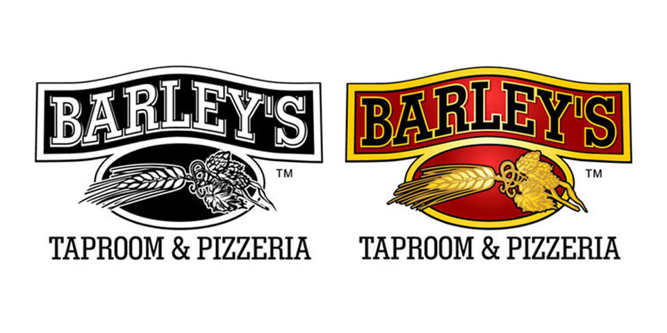
The previous logo featured rolling mountains and a rushing stream (see below); yet the Barley’s was expanding into new markets where there were no mountains – a logo change was needed. The barley and hops graphic was harvested from the previous logo and given prominence in the new Barley’s identity. The golden barley art on the crimson background suggests a warm, natural, wholesome experience awaits at Barley’s.
contributions:
art director
graphic designer
salesman
software:
Corel Draw
Adobe Illustrator