
 Tradedress is a common thread running thru most successful brandings.
Think of yourself getting dressed-up to attend an event. You might ask: how casual is the event? Which fashion makes the right statement? Is fashion acceptable or is the event formal? Choose a wardrobe that fits the occasion, and if you dare, accessorize with something that makes a statement or invites the curious to come closer.
This is what graphic designers should be good at: creating a graphic appearance that appeals to a specific audience. There are exceptions, but building a tradedress for a product or service can be easy to start. For example: bank literature should be simple yet formal and try to project confidence and security; health care ads are usually soft and light to express caring, comfort, and cleanliness; theme park marketing is bright and chaotic to communicate excitement and adventure. Matching a deisgn style to an industry is not complicated work; at the very least, a good graphic designer should know how to pick a pair of matching socks.
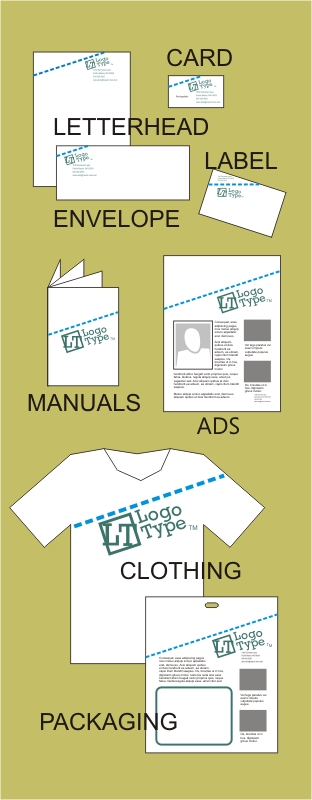
“Graphic Standards” are useful tools for communicating standards (uniformity) to large groups of people. Think of a Graphic Standard as a catalog. In the front, is a table of contents and further back are articles that speak about proper tradedress usage and extension. The standard demonstrates “how-to” project the tradedress across ads, brochures, manuals, posters, packaging, clothing, trade show booths, television, radio, the web, and even the product itself.
When designing a tradedress (or getting dressed for an event) it is important to remember: we get only one chance at a first impression and perception is reality.
Trademark laws attempt to provide justice in cases of tradedress infringements, the courts have repeatedly protected tradedress designs from competing imitations.
In one such case, Apple Computers produced the iMAC, a computer that ran MacIntosh software. The iMAC design was very unique in appearance and size, and it was available in several vivid colors. A competing computer company produced a similar looking computer that was also available in vivid colors – but it ran Windows software. The visible similarities of the two product lines was so substantial, and, the likelihood of confusion between the two brands was so significant, that Apple Computers filed suit and prevailed.
In a marketing context, a good tradedress design has an element of “genealogy”; the design should have elements that can be passed on to offspring marketing materials. And in my opinion, a good tradedress should have some sort of visual appeal, a flavor, or ambience that states a theme and allows for variation and adaptation.
The easy part – for me – is designing a standard, then approving it, and then publishing; the really hard part is getting the marketing staff to read it, learn it, live it.